I don’t think the design in images in my previous post made sense. (Some of you might say that it didn’t make sense because I was not clear in my message. Blame it on my poor writing skills.)
Let us revisit the images I shared in my previous post and let me explain what I believe went wrong in each of them.
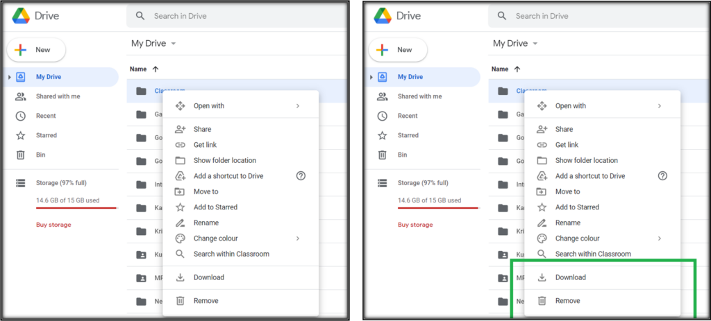
Google Drive
Download button right above the Remove button. I guess one of two most frequently done tasks with files in Google drive is Download. (Other one is to share the file). Now, placing that button all the way below, that too right above the Remove button is notorious.
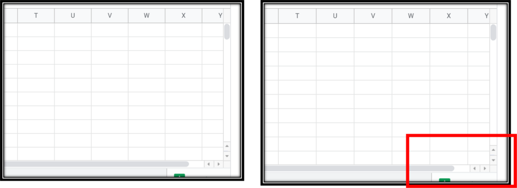
Google Sheets
The button to scroll up must be on the top of the scrollbar and the button to scroll left must be on the left side of the scrollbar. Why? Because that is how I move my hand/ mouse. If I have to go top, I take my cursor to the top and click that button. But, no. Somebody in Google thought it is better to put the go-to-top and go-to-bottom buttons (and right and left buttons) together will make it intuitive.
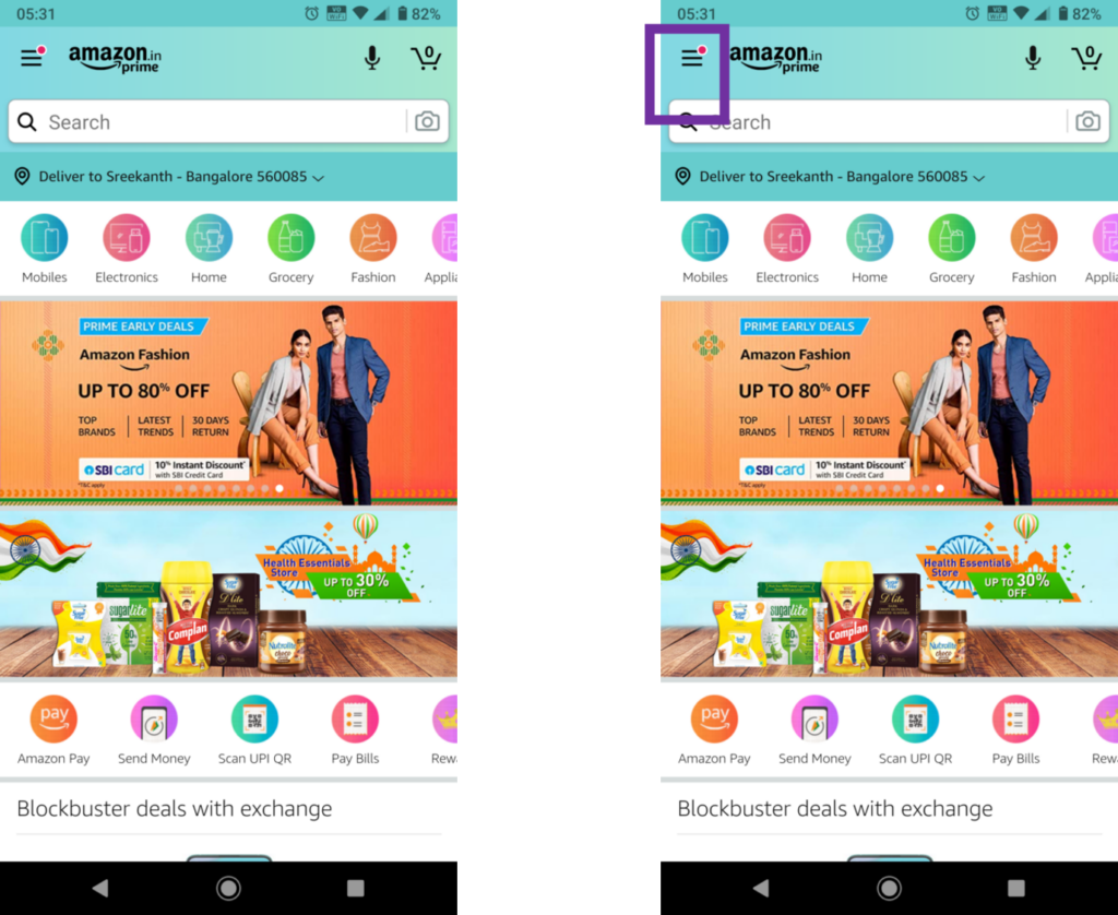
Amazon App
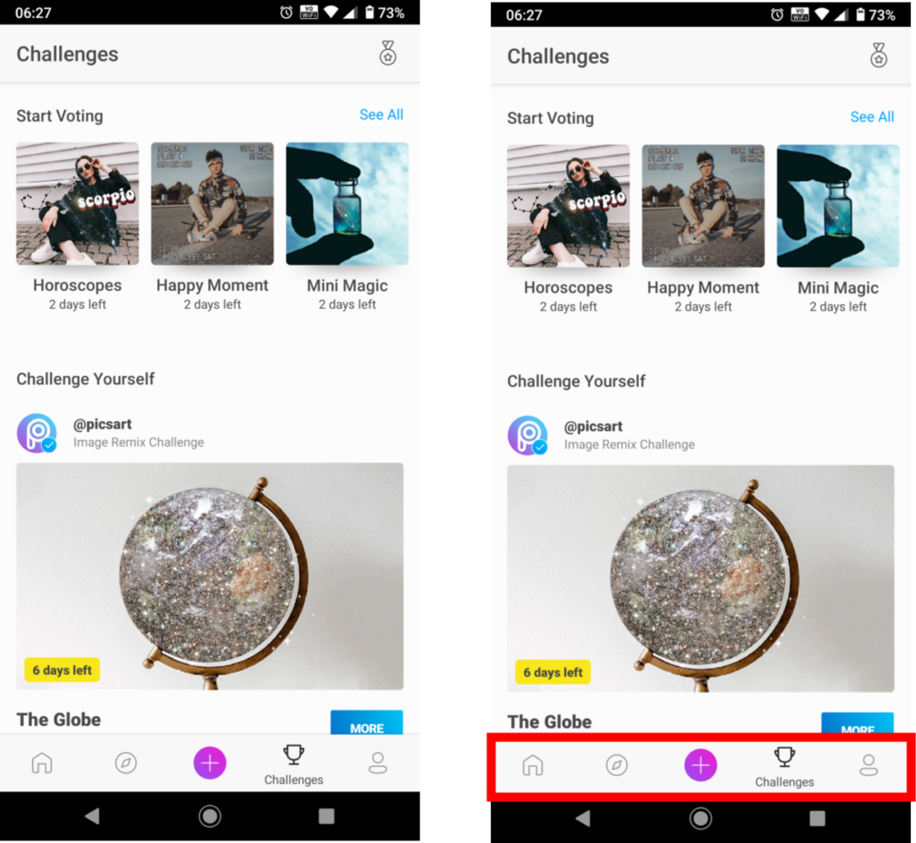
First time I saw this kind of Red dot above the Menu button, I thought I have some notification and clicked to check it. But I didn’t find anything in the Menu items. So, I went to Orders and some other pages looking for one without any luck. Then, I concluded that it is just a design.
For me, a Red or any kind of dot above a button indicates notification, perhaps an alert message. Amazon designers probably thought it is better to use this dot to highlight the Menu itself.
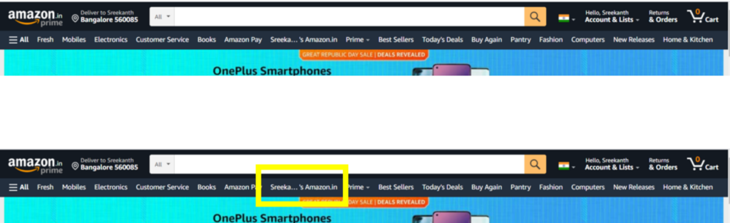
Amazon Website
Why on earth did Amazon put My account button in the Categories navigation bar?
Flipkart App
Commonsense, which most of the UX is, tells me that any UI element that is grayed out is disabled. But guess what? These two buttons are not. Click them and they work.
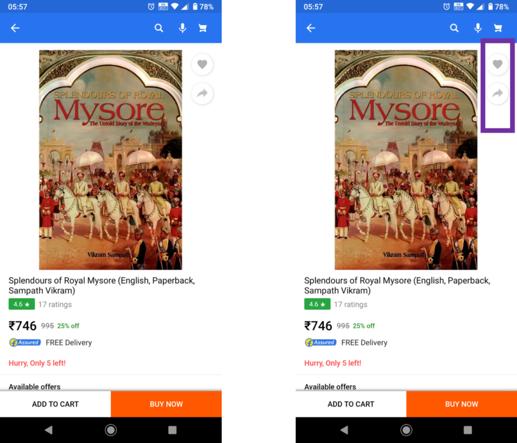
PicsArt App
This is a very interesting example. Perhaps the designer here wanted users to click every button to figure out what it does. That is why the text below the button appear only after clicking it. And that is a bad design. User should know what to click before and not after.
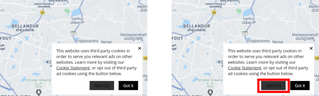
Uber
This is the most outrageous of all the examples. Just in case you haven’t figured it out, that is the Opt-out button. I understand Uber doesn’t want its users to opt-out, but this is certainly not the way to do so. (By the way, Google also has a very nasty trick to do so. Will keep it for some other day.)
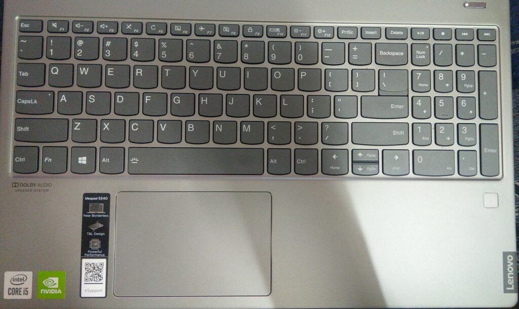
Bonus: Lenovo
I actually forgot include this in my earlier post. But here is a picture from my new Lenovo laptop. Any guesses what is wrong with this? Now that I have shared some reasons, this should not be that difficult. Comments welcome.
Are these even real issues?
In all the examples I shared, did users complain at all? Some of the justifications for bad design given by product team:
“They will get used to it.”
“Our users are not dumb.”
“Did you know how to walk when you were born? You learnt by standing up, falling, taking someone’s help, and finally started walking on your own.”
“That is a feature.” (I agree that consistent error is a feature though.)
“I tried with A, B, and C. They didn’t have any issues. You just exaggerate.”
“I was asked to keep it this way” (Being a designer myself, I have to agree with this. Very valid point.)
How would I know?
- Have you ever received a mail from an ecommerce site that you added some items to the cart, but did not check out?
- Didn’t the product you just browsed on Amazon show up with some discount on your Facebook account?
- Did a salesperson send you a mail offering you discount for the product you just browsed, but didn’t buy?
So, yes. There are software that track the mouse clicks/ hovers, time spent on each screen, time spent between mouse clicks, time spent to complete / abandon a task, idle time on a screen, etc.
Every wrong click, every abandoned task, every repetitive task, every additional minute spent on a screen is probably because of bad design. Probably because the users did not know what to click next or how to complete the task, clicked some button that took them to a wrong page and came back to try something else, spent time to figure out what to do and perhaps gave up.
Enough of your rant…
My next post will be on some tips on designing sensibly.
But before that, here is an example of what I believe is good design.
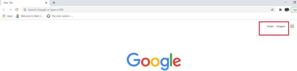
When you open Chrome, you will notice Gmail and Images apps can be accessed directly from outside Apps bucket. As a user, I know that those are my most frequently used Google apps. I believe Google did some studies before putting these two outside the bucket.
Make the user interface intuitive. Let the next obvious action be prominent.
More such examples in my next post.
What about that door thing?
In my previous post, I had mentioned about the way we opened doors.
Many of the doors have a handle or a sticker to pull or push to open. During Covid times, one of the recommended ways to keep ourselves safe was to use elbow to open the door. Now, you push the door with your elbow to enter but how would you pull using the elbow? We have lived through it. The door designer would probably say, “they will find a way out.” (pun intended).
Don’t ask me about “Slide to open” doors.
By the way, speaking of doors, have you come across a door that you have pull to open? Well…